Hinge (Dating App) | Novela Patrao
THINK ABOUT IT
Boy meets girl, they fall in love, get married, and have kids. That's the narrative many of us have grown up with. However, in India, this scenario often resembles an arranged marriage or the tale of our friend Sanjay, who found love with his childhood sweetheart. Yet, many of us find ourselves swimming in deep waters, hoping to catch a fish in the sea of potential partners. Hinge is the boat that rescues us from these depths, making it easier to find the right
HINGE - The Dating App Designed to be Deleted
The tagline, “Designed to Be Deleted,” is the clearest expression of what makes Hinge different. They don’t focus on keeping customers on Hinge, or keeping Hinge on their phones. They focus on helping users find a relationship... so they can delete Hinge forever. You don’t hear a lot of businesses refer to their own demise, much less celebrate it. Especially a company that relies on subscriptions to make money. How can a business survive if it was built with the intention of not being used?

Let's deep dive!
At the heart of Hinge
Hinge is more than just a dating app; it's a platform dedicated to fostering meaningful connections and reducing loneliness in the world. Guided by core values of authenticity, courage, and empathy, Hinge prioritizes building relationships, both romantic and otherwise. By focusing on these principles and values, Hinge aims to create a space where people can authentically connect and find companionship in an increasingly time-consuming digital world.

The Hinge Difference
Detailed Profiles: Hinge encourages detailed sharing of religion, education, and lifestyle for tailored matchmaking.
Proven Prompts: Activate your profile by answering three prompts, constantly updated for better dating outcomes.
Conversation Starters: Specific likes on profiles or prompts initiate conversations, increasing match quality.
Matchmaking Algorithm: Nobel Prize-winning algorithm ensures high-quality, compatible matches for meaningful dates.
Meaningful Likes: Users receive eight free likes daily to maintain quality matches.
Transparent Likes: See who likes you to prevent missed connections.
Reply Reminders: Friendly nudges ensure timely responses, reducing ghosting.
Smart Matches: Learn user preferences through date feedback for accurate matchmaking.
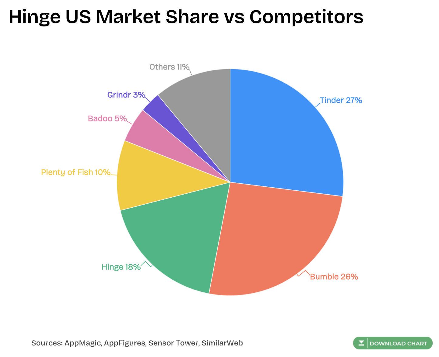
The Competition
TINDER
Tinder is a popular dating app known for quick swiping and casual hookups. It has a large user base and simple matching, but it's more about instant attraction than deeper connections like Hinge.
BUMBLE
Bumble lets women start conversations in heterosexual matches, which gives them more control. It's similar to Hinge in valuing meaningful connections, but it adds a time limit for initiating chats.
OKCUPID
OkCupid stands out for detailed profiles and a matching algorithm based on compatibility. It's like Hinge in encouraging authenticity, but it attracts a wider range of users in terms of age and relationship goals.
How is Hinge different from these apps?
1. You can change your location at any time, and without a paid subscription.
2. It is marketed as a “relationship app,” so most of the people using it are looking for something more serious rather than casual hookups.
3. Free members can see who already “liked” their profile.
4. Hinge has more advanced filters than most dating apps, so you can screen for height, ethnicity, family plans and religion in addition to the basics like age and distance. Premium subscribers have access to even more filters.
5. You're required to upload 6 photos or videos to “like” other profiles.
6. You can send a message at the same time you “like” a profile - meaning you don’t have to match before starting the conversation.
7. It’s not a fast-paced swiping app. Hinge focuses on match quality instead of a near-endless match queue. You can only “like” 8 profiles a day without a paid subscription.
8. The app will show you a “Most Compatible” profile each day.
9. After including a phone number in a message exchange, Hinge will ask you via a pop-up message a few days later whether or not you’ve met yet, and if you did, how you thought the quality of the match was. Your input on the match quality will help the algorithm select higher-quality matches as it learns your preferences.
Now we will dive into our User Goals - first stating Who is Our User?
The Hinge People - Our ICPs
ICP 1 - Gen Z Users

User Core Problem: In the swipe left, swipe right culture, the GenZ users always know they have more options available, which make them difficult to commit when things get tough
Other Current Solutions: GenZ users try fostering new relations at their college/college events, they use other dating apps and socials platforms like Snapchat to connect with new people
Feature Usage: Gen Z users gravitate towards features on Hinge that promote an option to put their best self forward - such as prompts with images, voice notes and About me. Their core goal is to make sure their profile stand out and they get matches
Time Spent: As for the above point, they are ready to spend a good time building their profiles, on an average they are also likely to use the app 5-6 times a week for shorter durations like 10-15 mins
Willingness to Spend: They are likely to first use the free features of the product before deciding on investing. They will check the results of the app and are very likely to continue using the free features for a long time.
ICP 2 - Young Professionals

User Core Problem: Young Professionals find it hard to find time to socialize but most importantly like-minded people, with most people their age in relations they seek apps to find other single people
Other Current Solutions: They are like to turn to networking events, single mixers, or social gathering to meet potential partners. However, these avenues may be time-consuming and less efficient
Feature Usage: Young professionals are likely to use features on Hinge that streamline the matchmaking process and prioritize quality over quantity, such as detailed profiles, compatibility algorithms, and conversation starters.
Time Spent: They are likely to use the app in periods mostly basis their schedules, they might use it over a month and then try again post 3 months. While using the app they spent about 30 minutes daily and use it more actively on weekends
Willingness to Spend: They may be more willing to invest in premium subscriptions if they perceive value in features that help them save time and increase the likelihood of finding compatible matches.
Next, we see our User's behaviour and determine what they are trying to do with
Customer Journey Map
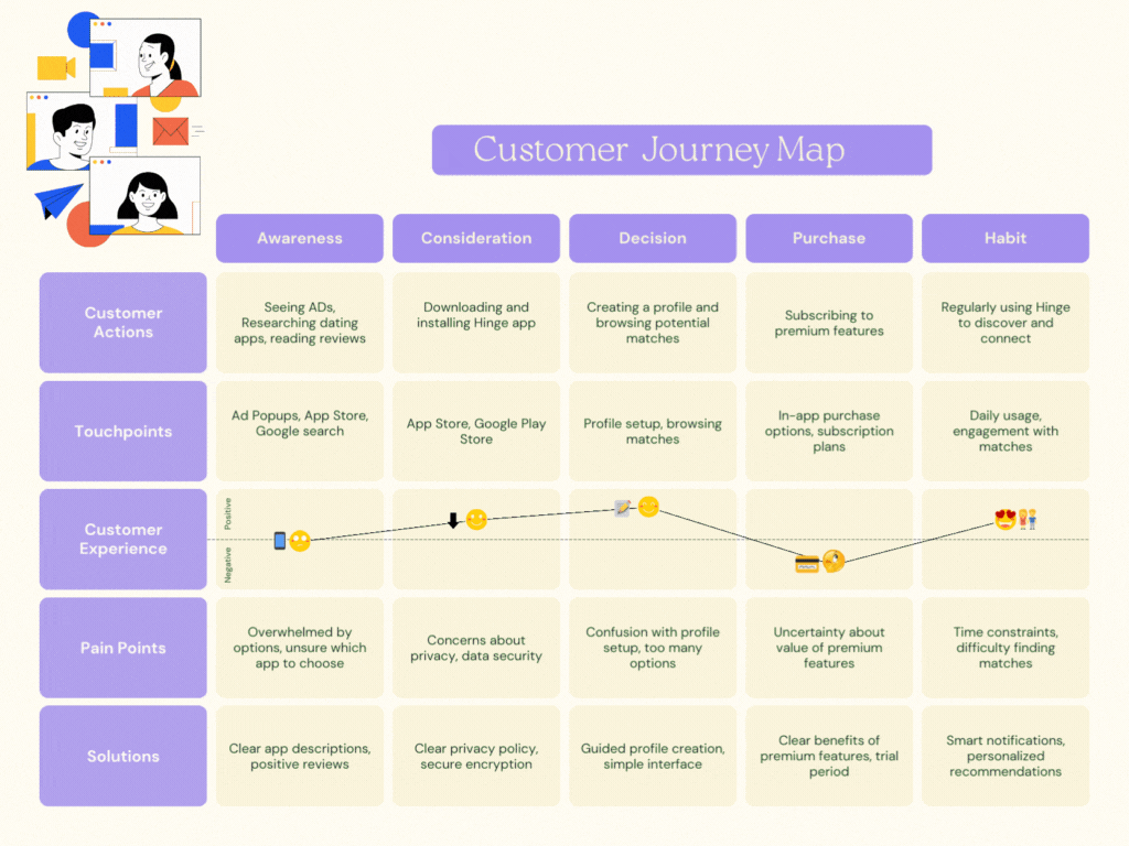
The customer journey map outlines the stages users typically go through when engaging with a dating app like Hinge. It begins with exploration, as users research and discover different dating apps, followed by consideration, where they download Hinge, set up their profile, and start browsing matches. Some users may choose to subscribe to premium features during the purchase stage. Finally, in the habit stage, users develop a routine of regularly using Hinge to explore matches and potentially form connections. Throughout the journey, Hinge addresses pain points such as confusion with profile setup and concerns about privacy with solutions like guided profile creation and clear privacy policies, enhancing the overall user experience.
Finally, we will see why are they signing up by defining our
Job To be Done
With JTBD we determine the framework for understanding why people do what they do. After understanding our ICP's we can state that the user 'hires' Hinge for these two main 'jobs'/goals.
'Personal goal' being the primary reason.
- Personal (Emotional Connection):
- Users want to feel emotionally fulfilled and connected through meaningful relationships. Hinge helps them find genuine connections and companionship, fulfilling their emotional needs.
- Social (Making Connections):
- Users want to expand their social circle and meet new people. Hinge provides a platform for connecting with others based on shared interests and values, helping users fulfil their social needs.
Validation from User Calls
Here are some top insights I got from user calls that validated my above hypothesis.
- Question: Why did you choose to go with Hinge?
A1: Tinder had become low quality with a lot of spam accounts, I also like Bumble but I find the accounts on Hinge much better. You find quality users.
A2: Other apps had too many paywalls
A3: I like the interface and the profile options, as a girl I hate that I have to text first on Bumble and that way I lose matches on Bumble, Hinge is good for busy people
- Question: Do you think you get more relevant matches with Hinge compared to other dating apps?
A1: Yes, one of the reasons I like Hinge is its detail and you can judge people not just by looks but their personality through the prompts Hinge provides.
A2: I've seen Hinge has more people looking to be in serious relations over causal
A3: I've actually made some great friends on Hinge, never really dated anyone I met there
- Question: Do you have any successful relationships, romantic or otherwise, from Hinge?
A1: Yes, I dated a person once whom I met on Hinge, we have broken up now
A2: No, I deleted it after a bit. Meet someone offline but I made some friends not actively in touch
A3: Yes, like I said I made some great friends and met my current best friend on Hinge.
Here's also a list of articles from Hinge studying user dating patterns and needs
1. Digital Body Language
A 2024 Hinge report on dating trends for Gen Z dives into overcoming rejection worries, emphasizing good "Digital Body Language" (DBL) and initiating the "What Are We?" conversation.
Here are some key stats mentioned in the article:
- A majority of Gen Z daters (90%) want to find love, but worry about rejection.
- Gen Z daters are 50% more likely than millennials to delay responding to messages. This could be due to a fear of rejection or simply a different communication style.
- Over half (56%) of Gen Z Hinge daters say they've overanalyzed someone's DBL. This emphasizes the importance of clear communication and avoiding misinterpretations.
- 57% of Gen Z Hinge daters admit they've held back from telling someone how they felt because they worried it'd be a turn-off.

2. Dating Pattern
Onboarding Teardown
Understanding How Hinge Works
Hinge is different from other dating apps. Instead of just focusing on casual dates, it aims to help people make deeper connections. It does this by letting users share more about themselves through prompts like "What I'm thankful for" or "My favourite trip."
The app isn't just about swiping left or right. It's about starting conversations based on these prompts. Hinge's goal is to match compatible people, not just give you a bunch of matches.
Key Things About Hinge's Business
Hinge cares a lot about how users feel using the app. It wants to make sure everyone feels safe and respected. It's also big on protecting your privacy. Your personal info is kept safe and the app is clear about how it's used.
Hinge offers both free and paid options. The free version gives you basic stuff, but if you pay, you get more perks like seeing who likes you and more control over your matches.
Google Search

Observations
We see Hinge does show up at the top of search results however it doesn't dominate the entire results. There are certain relevant pages about Hinge showing up.
When searching from another newer Google account, the result for the word Hinge was Hinges the industrial product
As Hinge's ideal touchpoint is not the website, we will briefly go through it to figure out what it does for a user
Watch this Link for the website teardown video

Website
The website doesn't really do much for a potential user
The website is mostly created from a branding perspective
It doesn't talk about the app at all nor does it have any app download options, which is strange
The website talks more about its mission, processes, and work done at Hinge Labs
A potential looker on Google might leave the page and ideally not go back to downloading the app
The App
We will now disect the app's onboarding process.
The images include various touch points that evoke certain emotions during the onboarding process. The observations from that stage of the process are further explained below each image
But first, let's meet Raj.
the
Raj is going to join us in our teardown and act as a representative through his actions of our emotions.
We start with the app store
Observations: On searching was the word Hinge we can see we see the Hinge app, while it's the first in ranking it stands in the second spot due to the competitor running ADs for its keyword. We also see other apps showing us below.
Biases: The first impression is positive when we see it's #3 top-grossing in dating with 10M+ downloads, this is social proofing
Frustrations: We also see a couple of negative reviews at the top of the review sections which talk about how the app has been unsuccessful for them. Reviews are also an important metric for our activation success.
Suggestions: The hinge team should be actively addressing relevant fixable issues in the reviews
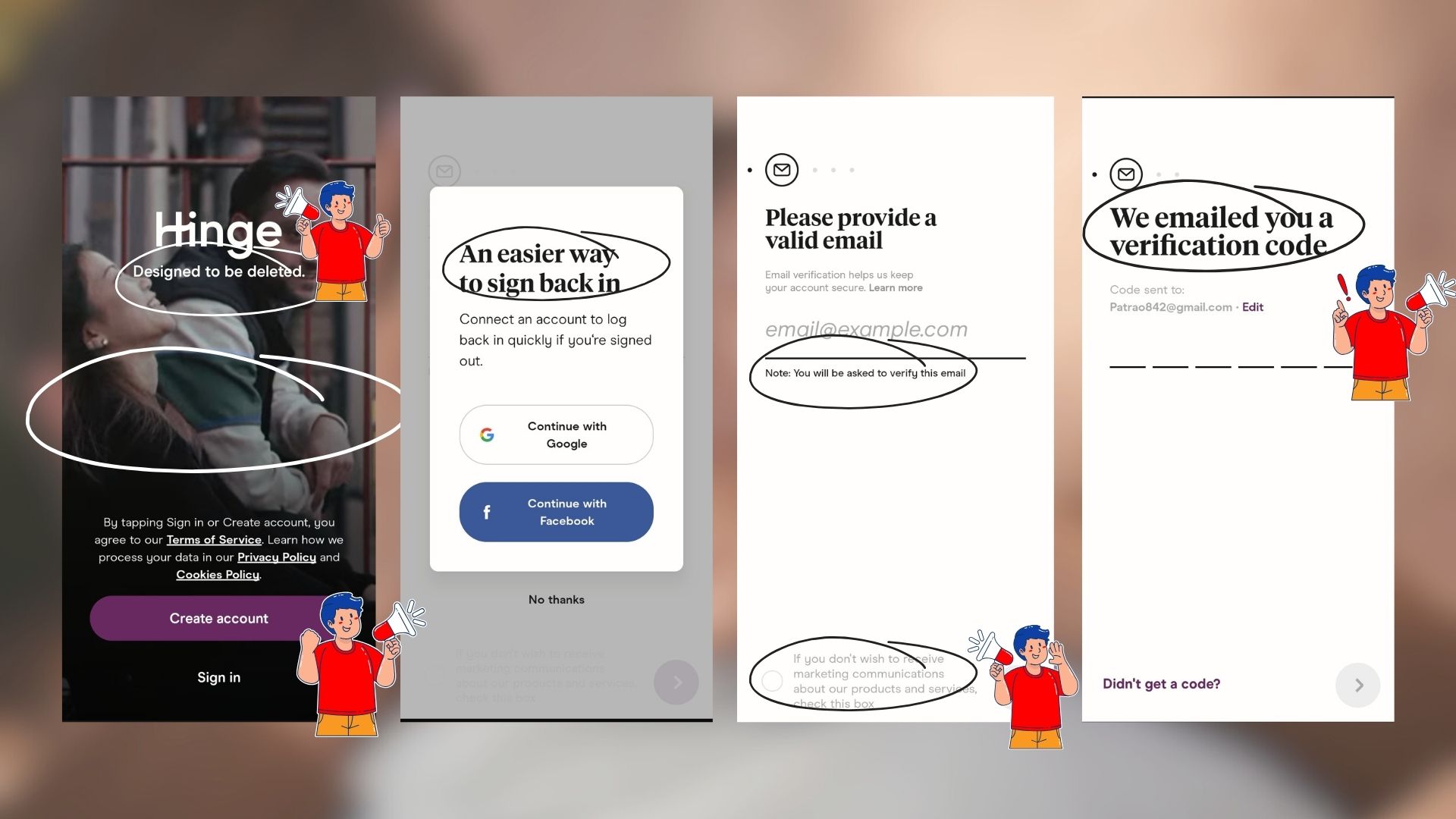
Observations: 1. On opening the app you are welcomed with a video running in the BG with options to Create an Account or Sign in.
2. You are promoted with an option to sign up with your email, while a phone number is easier when a user signs in back.
What's working: The video is a good touch which makes it's interactive. The bright Create account button against the dark BG is a clear CTC
Allowing users to opt-in for promotional emails is a good sign.
Frustrations: A user might not receive the email OTP as conveniently as a mobile OTP hence the user has to leave the app, which could cause them to not come back.
Suggestions: Allow to Create an Account with the mobile number first and then have the option to verify email once the profile is set
Observations: 1. Once you sign in there's a clear Terms and conditions popup which is useful for applications like Hinge where a lot of personal data is shared
2. The 'No Background checks' statement can leave a user confused. A little more prompt like the Why for last name could be added here.
3. By specially mentioning about keeping the community authentic we can see that there is likely to be a drop in fake profile creations.
What's working: 1. You can see there's a prompt which explains the 'Why' of an action, which is a helpful way for users to understand what you trying to build
2. The emoticons help with minimal interface style, adding character
3. Giving a subtext explaining the use cases of each step is useful, especially for users who are likely very hesitant initially giving out personal information on the profile.
4. Great use of copywriting.
Observations: 1. We again see an example of great copywriting to get users to enable notifications.
Notification enabling is an important feature as it's a way of getting users to the app and increasing the time spent.
Took Action: A popup showing up when you disable notification is again a great way to convert users, it's likely to get users to click on enable this time around with the clear button and now easy option to say no
AHA Moments: We see the two eyes peeping out of the line now have a body, we will see this mascot follow us through our onboarding, and the look of it changes as we progress in the process, making it engaging
Suggestion: We see that a user is able to pin its location on the app, now this also allows the user to pin it across any location. Unlike Bumble's radius, this can let you see users from any location, this has proved as an issue for certain users as per the reviews we have seen.
Observations: 1. There's a 'Hidden on profile' and 'Visible on profile' option option on each screen while some are compulsory, the rest can be chosen by the user's basis their preference of what they would like to showcase.
2. There are also many subtexts, which provide a sense of surety and assurance to otherwise hesitant users.
3. Along with the multiple option section button we also see a prompt for adding more details about certain questions like what a user is looking for. This helps users communicate their preferences and helps in positioning Hinge as a relationship-forward app.
AHA Moments: We can see there's an option to provide feedback on topics of pronouns and sexuality, as we have seen in the news around the world this can be a really sensitive topic and providing this option and an extensive list, makes it an AHA moment for LGBTQ+ people making them feel welcomed on the app and also prompting them that they are likely to see more people from the community
Biases: Confirmation Bias - Users might look for prompts or profile options that align with their existing beliefs or preferences, potentially reinforcing their self-perception.

Observations: As we further onboard we see a list of questions pop up, by this time the user has already spent >5 minutes on the process
Many questions are skippable
Giving users options such as 'Prefer not to Say' and 'Not Sure Yet' is a good sign
Frustrations: The dotted line shown above the questions shows the progress and intimate the user for the number of questions, busy users are likely to drop off
Suggestions: All of these questions can be asked later in the profile creation stage as of now the customer should be able to see the app features and get a chance to experience them
Biases: Cognitive Load - Users may feel overwhelmed by the amount of information required to create a profile, leading to fatigue or frustration during the onboarding process.
Hick's Law: Users may struggle with making decisions when presented with numerous options for profile customization.

Observations: After 15 prompted questions you reach these pages where you upload your images, add prompts and voice prompts
What working: There are on-screen tips given for image recommendations
Multiple options for image upload
Popup to avoid users for profile creation
Pre-fed questions in prompts and video prompts prove to be very useful
Suggestions: Giving tips or samples for Prompts and voice prompts like for images
AHA Moments:
Biases: Priming - Providing an option to add pictures from Instagram is a good option as that is where users are likely to upload their shots and then reuse them again
Nudge: Subtle hints or prompts during profile creation, as we see in 'Sure you want to SKip' This will get users to rethink and complete their profiles.

Observations: We finally reach the end of the process
A pop-up explains what's to be done
The Hinge logo has a loading style before the feed pops up, which creates anticipation, similar to how Netflix logo shows before a show
Suggestions: A better tour should be given explaining how to use the app, the user is likely to get confused, so a video tour over a text prompt would be more useful
Frustrations: You are immediately prompted with an option for premium, even before the user has experienced the app
AHA Moments: The two Google eyes in one turned into a full Hinge Mascot
The smart copywriting is likely to get user finally excited about the app 
Observations: We see there is a top banner showing Active, nearby and new users. This could be of great value
We see that unlike the traditional cross and tick, we have the X for a no and a heart which goes across different images and prompts, there's no right swipe but one can just share alike with a comment
Frustrations: Again you are hit with a roadblock you are unable to see any features or experience them before committing to building your profile.
The profile is a lengthy process and even frustrating for me to make for the sake of this project. A good amount of time is required to invest before you can start using the app.
Suggestions: Give users an option to check the app, they can save for later profiles they like instead of dismissing them and go back to them when their profile is complete.
Users shouldn't be prompted before they complete the profile
Observations: 1. We see it's compulsory to set 3 prompts at the minimum on your profile
There are many interactive features available like Polls, Video and Voice notes
You have a tab for edit and a tab to view how that would look on your page
What works: 1. We can dating tips on the profile page, which will help navigate the world of dating
2. There's a clear indication of what shows on your profile and what not
Finally, the subscription page, which has been prompted to us a couple of times
Observations: We see there are two types of Subscriptions available, the benefits for Hinge X are higher.
higher
Again we see good copywriting examples.
Smart use of 69% discount
Frustrations: The price points are really high compared to another dating app.
There's no one-day option like other apps
Suggestions: There's an auto debit feature set, which is not user friendly, an option for one-time payment like Canva should be added
With this, we complete the onboarding but we now need to track our Activation metrics. Hinge current onboarding process doesn't let its users experience the product until the complete profile has been set up. Hence, whether or not a user is retained will be post the user uses the app. So let's look at some of its features.
How does Hinge work?
- You can see your potential matches in three feeds - Discover, Standouts, and Likes You.
- In your Discover feed, you’ll scroll through profiles one at a time, and either “like” a prompt answer or a photo, or “skip” that profile by tapping the X.
- When you “like” a piece of content, you can also include a message. This feature makes starting a Hinge conversation a snap. If that person “likes” you back a match is formed and the message exchange begins.
- Standouts are a limited selection of profiles that changes daily. In this feed, you can see a prompt or photo prompt from a user's profile that’s chosen based on similar content you’ve previously liked. Tapping on the profile tidbit brings up the full profile.
- In the “likes you” section, free users will also scroll through each profile one at a time.
- One of the Hinge+ benefits is being able to see all the people who have already “liked” you all at once. Simply “like” them back by tapping the “conversation” icon and a match is formed.
- When it comes to exchanging messages, Hinge makes it easy to keep track of whose turn it is to send one. For instance, if someone has sent you a conversation starter, you’ll see a blue “Your Turn” tag in the list of active conversations.
- Hinge profiles consist of 6 photos or videos and 3 prompt answers.
- Each answer has a 225-character limit, and there are over 80 prompts to choose from - and the selection changes often
Hinge Features
- Prompt-Based Matching: Hinge uses prompts as conversation starters, encouraging users to engage in thoughtful dialogue based on shared interests and values.
- Mutual Likes: Users can express interest by liking specific parts of a profile, leading to mutual matches and potential conversations.
- Video Calls: Hinge offers the option for video calls within the app, allowing users to connect face-to-face before meeting in person. They also show Video Promots that users can use while on the call.
- Most Compatible Matches: Once a day, users receive a "Most Compatible" match recommended by Hinge's algorithm based on compatibility factors, increasing the likelihood of finding highly suitable connections.
- We Met Feature: After exchanging phone numbers with a match, Hinge's "We Met" feature follows up to inquire whether users met in person and their feedback on the match's quality.
- Standouts Feed: The Standouts feed presents specially selected profiles and photo prompts of potential matches, curated by Hinge's matching algorithm based on previous interactions within the app.
- Rose Feature: Users can send a "rose" to express heightened interest in a profile, similar to a "super like," with one free rose available per week and additional roses available for purchase.


Activation Metrics
When can we say that our user is an activated user?
1. When they complete building their profile, with prompts and images.
2. When they start using the app and exhaust their first set of likes
3. When they get their first match and start their first conversation
4 When the user comes back to the app post D1 at D7
5 When a premium subscription is purchased and used
To understand if a Hinge user is performing the above metrics we will look at some statistics and analysis available to us.
Hinge Key Statistics
Hinge statistics by numbers


- Hinge currently has 23 million users (Statista)
- 1.2 million users pay for a subscription (Dating Apps Market Overview)
Hinge earns a lot of money from people who pay for extra features. These subscribers get better stuff and enjoy the app more. This subscription model brings in a steady flow of money for Hinge. They've seen their subscription revenue grow over time, which is a big part of their total earnings. Because of this subscription money, Hinge can keep making the app better. They invest in updates and new features to keep users happy. This helps them keep subscribers sticking around, which makes Hinge stand out in the crowded online dating world.
- The number of users in the U.S. has exceeded 10 million (roast.dating)
- Hinge has been downloaded more than 35 million times since its creation (Statista)
- Hinge is the third most downloaded dating app in the world (Dating Apps Market Overview)
- More than 1 billion swipes are made on Hinge every day (Statista)
- More than 12 billion matches have been made since the launch of Hinge (Statista)/
Hinge statistics by match rate
- Men get on average 1 match out of 40 likes (roast.dating)
- 52 % of men have less than one match a day (roast.dating)
- 13 % of men have less than one match a week (roast.dating)
- Men like on average 1 out of 3 profiles (roast.dating)
- Women get on average 1 match out of 2 likes (roast.dating)
- Women like on average 1 out of 16 profiles (roast. dating)
Hinge statistics by users
- 64 % of Hinge users are male (roast.dating)
- The average age of people on Hinge is 25 years old (Dating Apps Market Overview)
- 42 % of Hinge users are 25-34 (roast.dating)
- 8 % are 55-64 (roast.dating)
- 35 % of Hinge users have a post graduate degree (roast.dating)
- Hinge users spend about 28 minutes day on the app (Statista)
- 85 % of users are looking for a relationship (Dating Apps Market Overview)
- 15 million are daily users (Statista) and 16 million are monthly users (Statista)
The number of monthly users on the dating app is about 16 million. It appears that each Hinge user is really committed to making the app work for them, hence the similar number between daily and monthly users on the app.


Hinge Revenue

Hinge Acquisition Sources:
a

Average TAT for Profile Setup
- Basic Setup (5-10 minutes): This involves filling out the essentials and a few compulsory prompts and skipping the rest.
- More Polished Setup (30 minutes - 1 hour): This involves setting up you images, prompts, audio, and answers that showcase your personality and interests.
Here are some factors that can influence setup time:
- Adding photos
- Crafting Prompts
- Decision Fatigue
Based on these statistics, we can base the following hypothesis for Activation Metric
Here are my 5 Hypothesis and Reasoning
- Profile Completion Time: I believe activation for this metric should be completing the profile setup within 24 hours. Users who complete their profiles quickly are more likely to be actively engaged and invested in using the app, leading to higher retention rates.
- Initial Likes Sent: I believe activation for this metric should be that the user exhausts its first free 8 likes within the first 48 hours. Users need to explore that app and other profiles to perceive that there could be potential people of interest on the app, which in turn they will express with likes.
- First Match: I believe activation for this metric should be making atleast 1 match within the first 48 hours. Users who successfully match with others early on are more likely to perceive value in the app and continue using it to explore potential connections.
- First Message Sent: I believe activation for this metric should be sending a first message to a match within 24 hours of matching. Users who initiate conversations early demonstrate active engagement and interest in interacting with potential matches, indicating a higher likelihood of continued usage.
- Exploration of Premium Features: I believe activation for this metric should be exploring premium features within the first 7 days of signing up. Users who engage with premium features early on may be more likely to consider upgrading their account, leading to higher subscription rates and potentially increased retention.
- Daily Usage Frequency: I believe activation for this metric should be logging in and using the app at least once a day for three consecutive days. Users who establish a habit of daily usage early on are more likely to integrate the app into their routine and continue using it over time, contributing to higher long-term retention rates.
In conclusion, below will be our
Metrics to evaluate the effectiveness of onboarding flow:
- D1, D7, and D30 retention
- DAU/MAU ratio
- Subscription rate vs retention
- Average time to complete profile setup (TAT)
- Acquisition sources of activated users
- Product reviews and feedback from activated users
CONCLUSION
At the start we said that 'HINGE was DESIGNED TO BE DELETED" and wondered how that works for a subscription business, while we can state that Hinge is a growth trajectory, its core focus stays in User Success Stories over In-app engagement, retention and so on.
However, from what we saw, I believe a few improved metrics like giving the users a taste of the app before they have to go through a lengthy onboarding process, doing a video tutorial explaining the app, option to come save profiles for later until they build their profiles so meanwhile they can explore who's available on the platform, can help achieve increased AHA moments, also free trials of premium version like video prompts can help users initiate fun conversation and achieve smaller milestones like planning more dates. This will not only help the user achieve his goals but also build a strong word-of-mouth and a well-chartout success story.
Cheers!
Brand focused courses
Great brands aren't built on clicks. They're built on trust. Craft narratives that resonate, campaigns that stand out, and brands that last.


All courses
Master every lever of growth — from acquisition to retention, data to events. Pick a course, go deep, and apply it to your business right away.


Explore courses by GrowthX
Built by Leaders From Amazon, CRED, Zepto, Hindustan Unilever, Flipkart, paytm & more
Course
Advanced Growth Strategy
Core principles to distribution, user onboarding, retention & monetisation.
58 modules
21 hours
Course
Go to Market
Learn to implement lean, balanced & all out GTM strategies while getting stakeholder buy-in.
17 modules
1 hour
Course
Brand Led Growth
Design your brand wedge & implement it across every customer touchpoint.
15 modules
2 hours
Course
Event Led Growth
Design an end to end strategy to create events that drive revenue growth.
48 modules
1 hour
Course
Growth Model Design
Learn how to break down your North Star metric into actionable input levers and prioritise them.
9 modules
1 hour
Course
Building Growth Teams
Learn how to design your team blueprint, attract, hire & retain great talent
24 modules
1 hour
Course
Data Led Growth
Learn the science of RCA & experimentation design to drive real revenue impact.
12 modules
2 hours
Course
Email marketing
Learn how to set up email as a channel and build the 0 → 1 strategy for email marketing
12 modules
1 hour
Course
Partnership Led Growth
Design product integrations & channel partnerships to drive revenue impact.
27 modules
1 hour
Course
Tech for Growth
Learn to ship better products with engineering & take informed trade-offs.
14 modules
2 hours
Crack a new job or a promotion with ELEVATE
Designed for mid-senior & leadership roles across growth, product, marketing, strategy & business


Learning Resources
Browse 500+ case studies, articles & resources the learning resources that you won't find on the internet.

Patience—you’re about to be impressed.